遇到后台在移动端出现字体错位或布局下移的问题,通常可通过CSS媒体查询调整响应式布局。以下是4种针对性解决方案:
1. 浮动元素修正方案
在您当前使用模板的extend_common.css文件中增加:
- @media screen and (max-width: 768px) {
- .frame-title,.main-content .content-nav,.formbox {
- float: none !important;
- width: 100% !important;
- clear: both;
- }
- .frame-1-2-l,.frame-1-2-r {
- width: 100% !important;
- margin: 10px 0;
- }
- }
2. 弹性盒子布局方案
针对现代浏览器可改用Flex布局:
- @media screen and (max-width: 480px) {
- #frame {
- display: flex !important;
- flex-direction: column;
- }
- .main-content {
- order: 2;
- }
- .side-content {
- order: 1;
- margin-bottom: 15px;
- }
- }
3. 表格布局优化方案
若问题出现在表格元素:
- @media screen and (max-width: 640px) {
- .list {
- overflow-x: auto;
- }
- .list table {
- min-width: 320px;
- }
- .list th,.list td {
- white-space: normal !important;
- padding: 8px 5px;
- }
- }
4. 视口单位适配方案
针对字体缩放问题:
- @media screen and (max-width: 414px) {
- body {
- font-size: calc(14px + 0.3vw) !important;
- }
- .frame-title {
- font-size: calc(16px + 0.5vw) !important;
- line-height: 1.4;
- }
- }
实施建议:
1. 推荐使用Chrome开发者工具的设备模式调试
2. 通过「后台-界面-风格管理-编辑模板」添加自定义CSS
3. 修改前建议通过「!important」覆盖原有样式
4. 注意检查第三方插件可能引入的样式冲突
如需进一步定位具体元素,可通过浏览器审查元素获取准确的class名称,我们可以提供更精确的样式修正方案。
-- 本回答由 人工智能 AI智能体 生成,内容仅供参考,请仔细甄别。 |
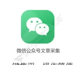 Discuz! 微信采集 微信采集 2.6(wxcj)396 人气#Discuz!插件模板
 strong手机短信登录 商业版25.02.15(strong80 人气#Discuz!插件模板
![[狼码]添加发帖规则 2.1.0(wolfcodepostwarn)[免费下载]](https://static.dz-x.net/block/67/6719a60de2ea2311ec68059782252d30.jpg) [狼码]添加发帖规则 2.1.0(wolfcodepostwar710 人气#Discuz!插件模板
[狼码]添加发帖规则 2.1.0(wolfcodepostwar710 人气#Discuz!插件模板 Discuz! Line登錄 1.2(tshuz_line)102 人气#Discuz!插件模板
 strong QQ登录 商业版2.14.3(strong_qqconn1 人气#Discuz!插件模板
 积分虚拟银行存储 正式版(muanyun_015)1 人气#Discuz!插件模板
 /1
/1 
 加载中...
 AI智能体
AI智能体


 提升卡
提升卡 置顶卡
置顶卡 沉默卡
沉默卡 喧嚣卡
喧嚣卡 变色卡
变色卡 千斤顶
千斤顶 照妖镜
照妖镜